For the new year I may be working a bit smaller again as there are a number of techniques I’d like to practice, and it’s best to do that on smaller rather than larger pieces of cloth.
Reflecting on my work this past year, and what I hope to see this year, I made a list of words that describe what I hope to evoke:
Feral, Wild, Untamed: Because I’m not a product of an art school, I’m mostly self taught with help from friends, books and some inspired and inspiring teachers outside of academia. I think my fearlessness and willingness to do things that may seem crazy –these are both strengths and potential weaknesses, but they are part of what makes me who I am.
Big Gestures: I’m not so good with tiny tiny things. I’m awful at making tiny stitches, with tiny pieced work involving many small pieces of cloth, with stitching or cutting a straight line. One way of thinking about this is that it’s a weakness, but I prefer to find a way to make it part of my voice.
Jazzy, Improvisational: I hope that I can continue to develop this aspect of my work, unexpected color and line combinations, surprising rhythms and textures. How could I not have this kind of music in my soul, born and bred of New Orleans.
Color: Something I continue to work on. I want to develop more and more my own signature colors, unexpected and seductive. To be known, eventually, as a kind of colorist.
Brokenness, Rips, Frays: They are beginning to be an essential part of my work. Perhaps because my familial relationships are so very broken and painful. Finding some way to render these as both painful and beautiful.
Words. I think these will always be a part of anything I do with cloth. Even if it is only for the mark, not the sense of the word, although that seems a bit like heresy.
]]>
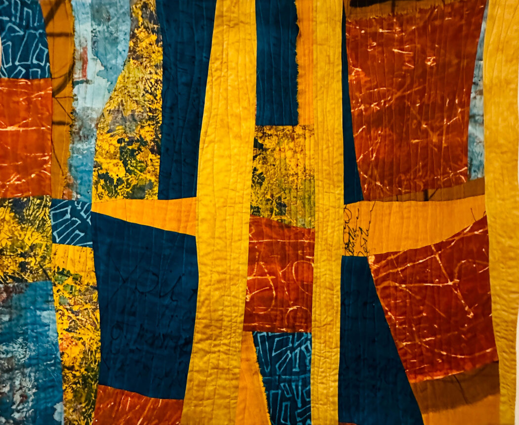
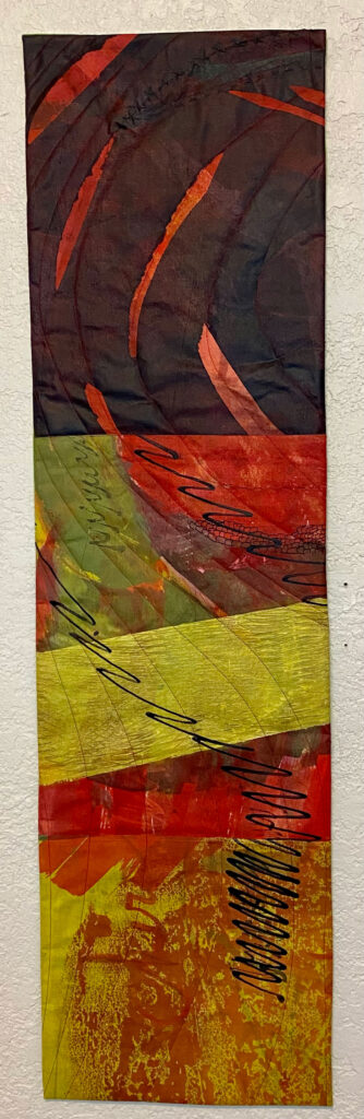
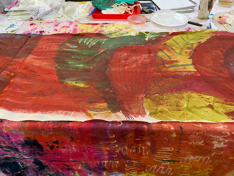
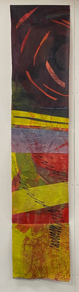
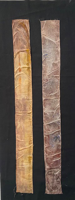
I haven’t posted for awhile. I’ve been at Nancy Crow’s Timber Barn studying with Claire Benn, and came back so inspired and full of ideas and color I’ve done almost nothing but work in the studio. I started some large pieces while at the Barn, challenging myself to take advantage of the large printing tables they have. This piece is 13 x 55, and was printed using a break down screenprinting method. The piece was twice this size but I cut it in half because I wanted a kind of totem pole vibe. This is the second half, which is now a second piece, slightly larger at 17×59:
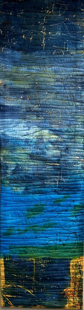
I thought it would be interesting to quilt this one horizontally but I think I like the vertical quilting (on the first one) better.
The screen I used had text that I scribbled on it using a needle nose bottle. When I scraped the color on I deliberately let the fabric wrinkle, which made for some beautiful marks.
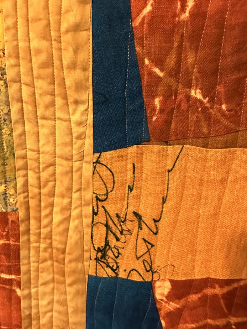
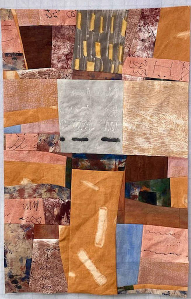
I’m also really happy about another piece I just finished:
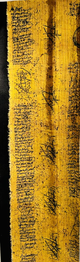
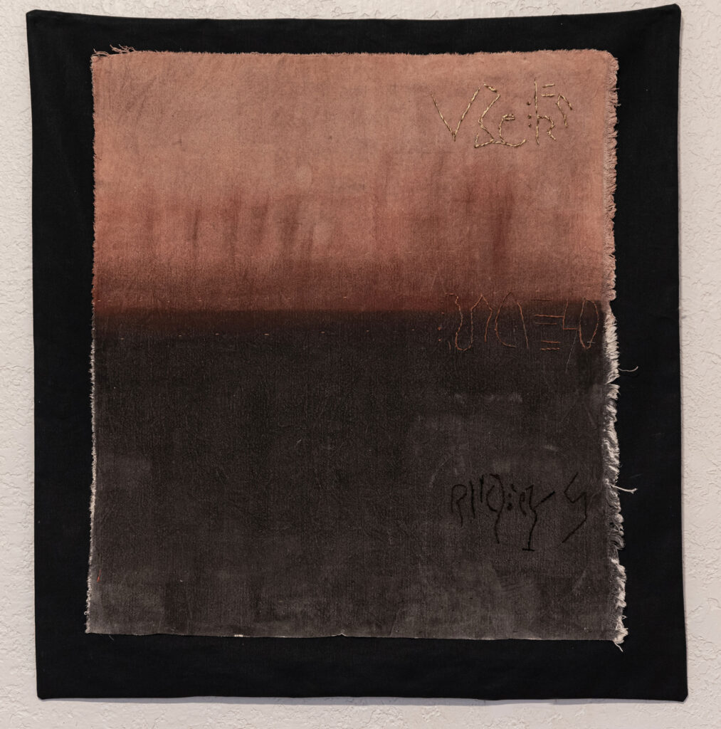
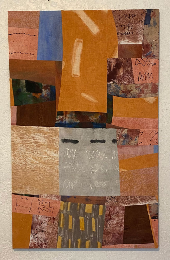
This one is 17×57. It’s tentatively called “A Mother Who Loves Books,” because I was thinking of my mother when I made it, and the text is a poem from Let it Be a Dark Roux, “My Mother’s Perfume.” It’s linen, and I am loving how unfinished linen looks like on the edges. I’ve been working on a few more, unfinished, pieces using torn linen, and I can’t imagine tiring of the tearing for awhile. There’s something powerfully, almost…archaic about linen that’s unraveling a bit at the edges. This piece was originally twice this size horizontally but it felt too symmetrical, and Claire showed me a way of getting rid of the symmetry by manipulating the fabric–I cut off a bit of one side and folded the middle, leaving the pleat. There’s no batting, only a backing of black felt, which I allowed to project beyond the back. The marks in the middle are a kind of graffiti–my mother’s name and my name written over each other. I added texture to the fabric with a crumpled piece of parchment paper dipped very lightly in a couple different colors of thickened dye then again very lightly touched onto the fabric.
I’ve been working a lot with color these days; right now it’s shades of yellow, gold, curry, mustard, etc. This is one of the first ones that I experimented with different mixes. I think this one is about 7 Golden Yellow to 1 Hot Chocolate, maybe a touch of Rust Orange. What fun!
]]>https://etruscanpress.org/wp-content/uploads/2023/02/SSG-interview-1.6.pdf
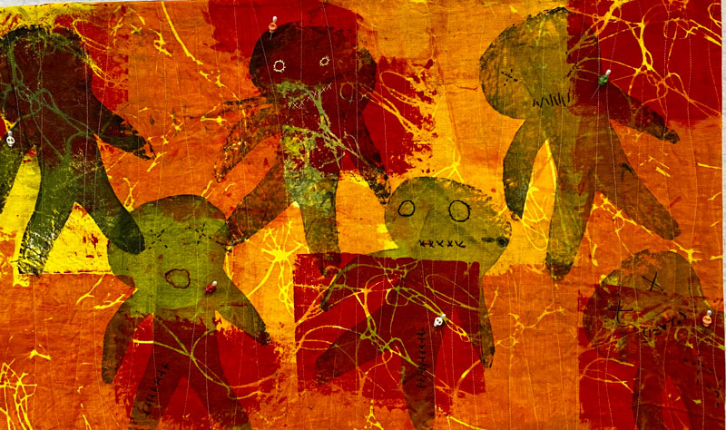
]]>The newest pieces there, which I just hung yesterday, and which you can find on the website, are Voodoo Dolls Dancing:
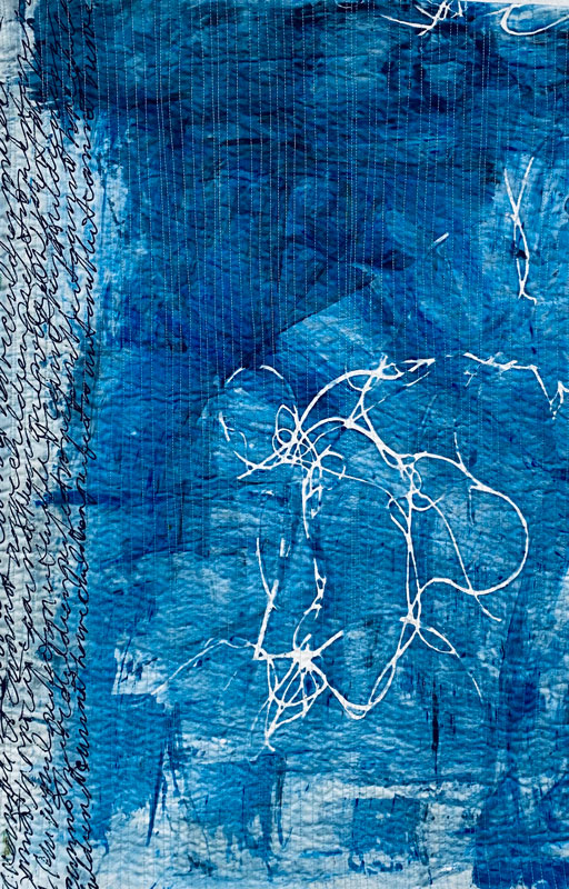
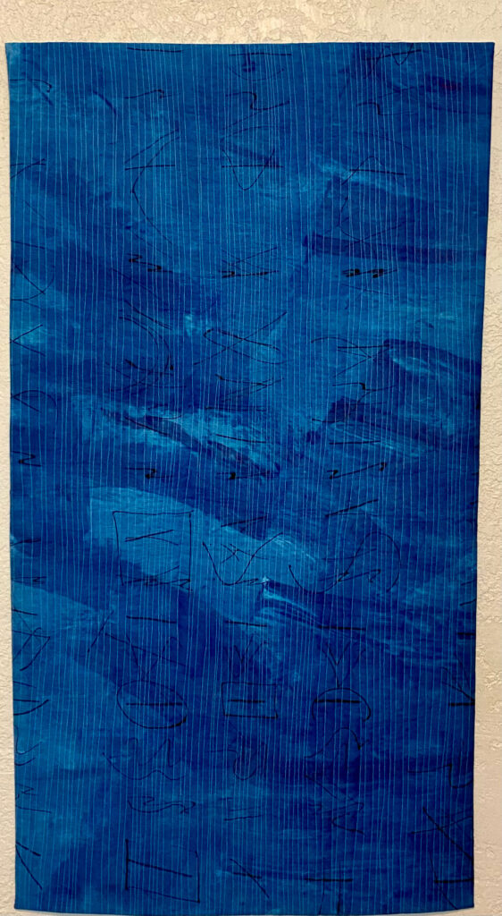
And “Blue Scroll,” one of the Hundred I mentioned in an earlier post.
As a member of the collective, I work at the gallery three days a. month. Stop by and visit when you’re in town.
]]>
I’m happy with the movement of this piece, and I learned an awful lot about how to work with acrylics, which I both hate and love. I don’t like what it does to the hand of the fabric, making it feel like rubber, but my god it is so easy to work with–no batching, very little prep, etc. And of course, there’s the issue of having white, which you don’t have with dye or thickened dye or earth pigments.
The second week with Claire was more difficult for me, and there were moments of anger and sadness, even tears! This was the week we were supposed to “work with intent,” and I had lots of intent. I won’t go into all the ideas I had, but let’s just say there were too many, and none of them were really working out as I hoped the first couple of days. I remembered what the French poet Mallarme supposedly once said to the painter Degas when he complained that he didn’t understand why he couldn’t write successful poems since he had “so many ideas.” Mallarme reminded him that poems were written with words, not ideas. I realized that my eyes were bigger than my “hand” if you will, and that I simply didn’t yet have the technique I needed to accomplish what was in my head.
After much hand wringing and many failed attempts to bring about my ideas with thickened dye, I picked up a needle nose bottle, filled it with with black thickened dye and began scribbling on fabric. If nothing else, I thought, I’ll master the needle nose. It felt familiar, like a pen or pencil. After experimenting with the thickness of the dye, the pressure and slant of the needle nose, I wondered what would happen if I wrote across pleated fabric. I started folding the fabric in various ways, scribbling across it and opening it up to reveal broken words and phrases that looked, oddly enough, like runes. I tried this in various ways, most of them unsuccessful, but then:
This happened. And then this:
I was happy with these two, and when I did my final presentation to the group I noted that I felt confident I could bring this technique of needle nose work and pleating back to my studio and develop it more fully and perhaps with more complexity. Claire approved and gave me the order to make 100 of these. She had given the same assignment to Nancy Crow when she was learning how to monoprint. According to Claire, Nancy had been complaining she didn’t get this monoprinting and Claire reminded her of how long it had taken her (Nancy) to learn how to cut fabric without a ruler. “Make 100 of them,” Claire said. A few months later, again according to Claire, Nancy called to tell her she had made 100. She subsequently published a book of the best of these. Claire reckons I’ll wind up with 20 that are just ok, 20 that are wonderful, and, well, who knows about the rest.
And I’m happy to have found a technique that includes my love of fragmentation as well as an acknowledgement of my work as a writer.
So here are the first two of a hundred. Stay tuned.
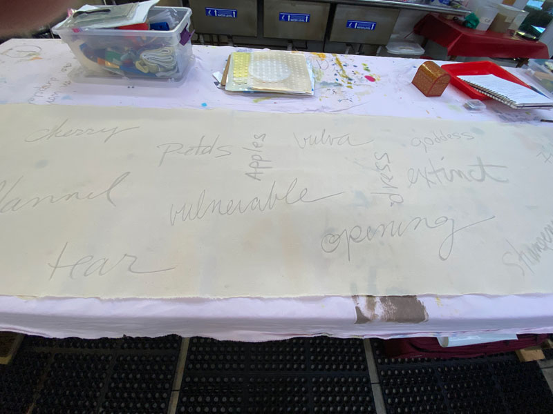
]]>We were asked to pick three images or a piece of writing that resonated with us. We then spent time journaling words and phrases that the image or writing evoked in us. We were provided with a 10 foot by about 3 foot scroll of muslin that had been pre-primed with a 1-1 solution of liquid gel medium and water. We were asked to pick a six-color palette plus black and white.
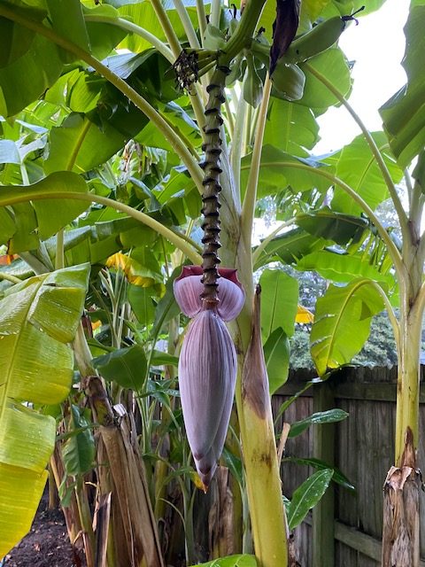
I started with an image of a banana flower, an angel’s trumpet, and a poem, “Reasons to Live: the Color Red.” I loved the plum colors of the banana flower and the jumble of green leaves beyond it:
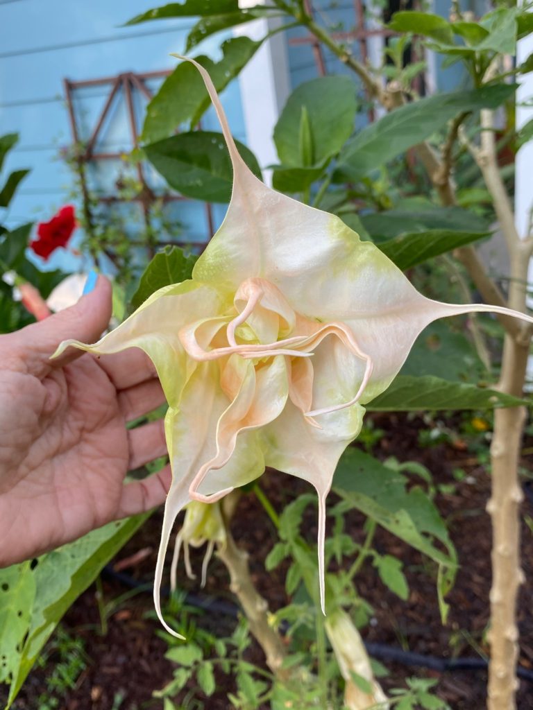
I loved the star-like shape of the Angel’s Trumpet as well as the soft, subtle peach and apricot colors:
And I wanted to find a way to evoke the emotional power of the reds in this poem:
Reasons to Live: The Color Red
cowboy boots, scarlet suede
still in the box, smelling like sex
pomegranates, the seeds plumped open
their dark juice seeping into the butcher block
whole cherries in preserves, full
in your mouth, a thick spoonful,
fat raspberries, autumn apples, the memory
of a rich Cabernet or spicy Shiraz,
sun-warm tomatoes from your garden
thick steaks rare and soft,
their blood speaking tongues in your mouth,
your flannel nightshirt, tartan-frayed and forgiving
the dresses from your youth burning
in the closet like coals from a good fire,
salmon when they are dying,
maple leaves when they are dying,
your favorite color before you knew
any better, first color you sang,
the color you love in your mouth,
color that announced your birth into the world.
After journaling we were asked to write words on the cloth. I used a thick graphite pencil to write mine.
We then drew our images first by memory and then by copying directly from either the image or a photo onto the fabric, again I used graphite. and than outlined them with color. I used a couple different sizes of paint brushes. I didn’t like the way the shape of the banana flower was coming out so I decided to drop it from future considerations. The pale colors of the Angel Trumpet as well as its shape proved difficult for me to handle and I decided to drop that as well and focus on the imagery from the poem.
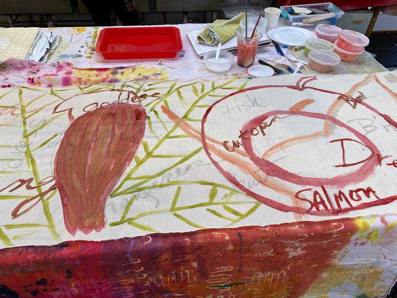
Above you see me playing with shades of red for a fruit-like shape, and chartreuse for what had started out as banana leaves. Below I’ve added some deeper greens that I decide I don’t like and will later get rid of.
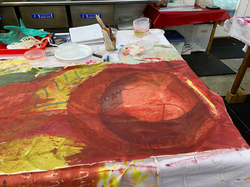
I did quite a lot of manipulations including pleating, cutting and inserting paper, etc. I was beginning to think of this as a whole cloth, sort of totem-pole like, though Claire had warned us no final pieces might come from this series of exercises, that it was about exploration. Here, above, I obliterated much of the red as it felt too overwhelming. Using masking paper resists I left enough of the red to suggest the circle that had been there before.
Here, above, you can begin to see what it’s starting to look like. I also obliterated some of the dark green I didn’t like with a Titan Buff heavy body acrylic that I then scratched into to make wavy marks. Later I will paint over this in chatreuse. You can also see the pleat in this photo.
Here, after more manipulation and adding scribbles with a needlenose bottle, doing some monoprinting and beefing up the chartreuse, I decided to cut off a few feet off the bottom–I had been working with trying to evoke plaids from the poem but it wasn’t working out so I decided to cut it off. I also decided to cut the whole thing in half. I wanted to break up the circle up top, which felt too dominating.
First time I hang it. It feels like there is too much going on, although I like the colors and movement. I decide to edit and cut more out.
And here’s what may be the final edit. I’ll have to wait til I get home to sew it up and I may make a few more tweaks. I’m happy with pretty much everything in this final edit, although it has moved so far from where I began as to be unrecognizable. What a wondrous process.
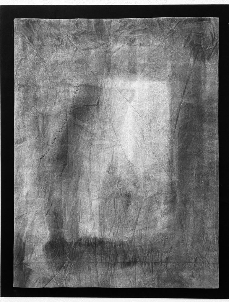
]]>This first one is mounted onto black canvas. It’s such a mysterious piece to me. I mentioned in an earlier blog, I think, that I never meant for this one to be a piece on its own, but rather a background for another piece. But somehow a door appeared and a shadowy figure in that door. The wrinkles in the canvas add to the mysterious texture. It feels like my son is coming out of the cloth and speaking to me. I used a pillowcase facing, lightly quilted it, then used a fabric adhesive tape to attach the quilt to the black canvas.
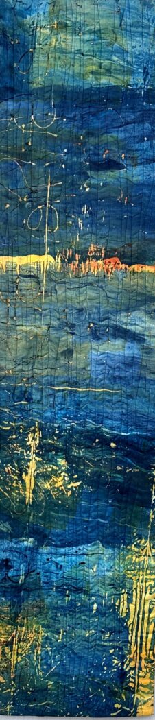
This next one I called Savannah Sunset because the colors remind me of the sunsets we see almost every evening on our walk to the Savannah river. All the fabric was painted, dyed or printed in some way in Claire Benn’s workshop earlier this year with earth minerals. I had lots of fun experimenting with a new medium, but few of my pieces felt successful as a whole cloth. These were cut up and pieced. One of the recurring pieces of fabric (guess which one!) was actually my mop-up rag. I like how the “writing” moves across the fabric, both interrupting and connecting the various colors. I didn’t quilt this one at all as I didn’t think it needed it. I simply stretched it onto a frame. You have to be careful when doing this, I realized, not to warp the design or pull the seams apart. The fabric here is linen and canvas and a few pieces of cotton. I think had it all been cotton it might not have stretched as well.
This next one I posted earlier before I mounted it on black canvas so I won’t say more about it here, except that I like the little S-like squiggle on the bottom left. I decided on it at the last moment but I might try to add something like that on future pieces. It echoes the S of my name. I finished this one using facing, then glued it onto black canvas I had stretched onto a frame. I used Tear Mender fabric glue.
This one (above) is actually “finished,” that is, it’s quilted and “bound,” using hidden binding, also known as face, or art binding. This is my go-to binding for art quilts. Unlike the binding for traditional art quilts, you can’t see this binding on the front side. I could make a hanging sleeve for this quilt but since it’s not very big or heavy (about 18″ wide and maybe 46″ long) I think I may be able to get away with inserting a small dowel into the space left between the facing and the quilt. Going to try that first.
This quilt was made using hand-printed fabric.
This one, not yet finished, will be put on a canvas, a new process for me. I’ve been experimenting with stretching pieces on canvas, like painted art, because it’s so much easier to hang. I’m still learning how to do it.
The fabric was painted with earth minerals–deep wrinkles in the fabric made the fascinating texture on the piece. I didn’t want to iron or stitch the painted strips as I felt it would take away from the texture already there, which I loved–you may have to see it in person to appreciate it–. Instead, I glued it to black canvas, allowing some of the rough edges and stray threads to remain. I have stretcher bars that will fit this piece, but I haven’t decided if I’ll actually wrap the quilt around the stretcher bars (which means I’ll have to add more black canvas on the edges if I want to keep this size), or if I might just attach the piece to a larger canvas, maybe a deep brown or tan…or black. I’m also thinking I might add some light stitching to the black canvas, though I don’t want to take away from the minimalist design. Will have to leave this up on the wall for a bit to decide.
This one, improvisationally pieced using fabric I painted and printed with earth minerals, is not yet quilted or finished. It’s large, about 2.5 feet by 4.5 feet, and I’m considering stretching it on canvas. Will write more about this process in another post.
]]>
And what are we to make of the bitter ginger flower (also known as shampoo ginger)?
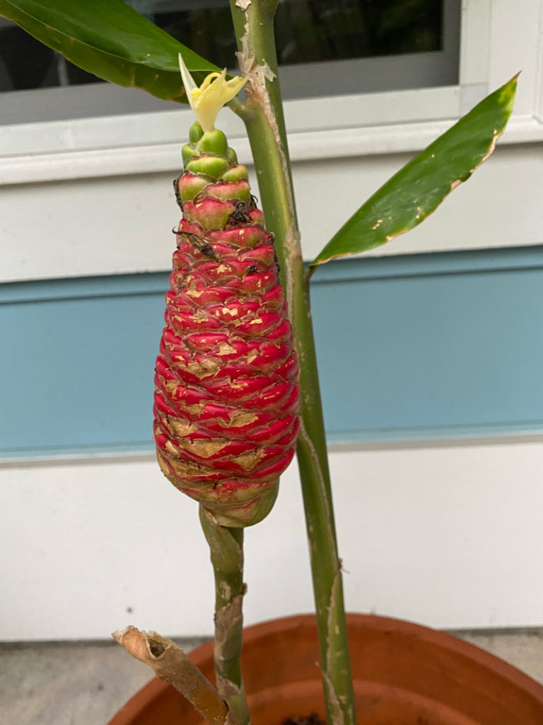
Today I will harvest the flower, and wash my hair with its juices. I love the cone shape of the flower and even the rough edges where some of the petals have fallen off. How to evoke ginger in a poem or piece of art?
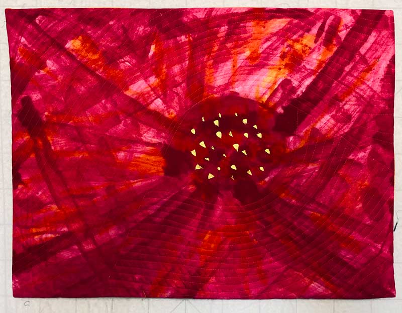
I have several shades of hibiscus in my yard that never fail to bring me joy, though the flowers only last a day.
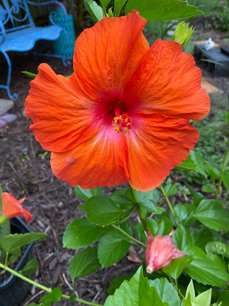
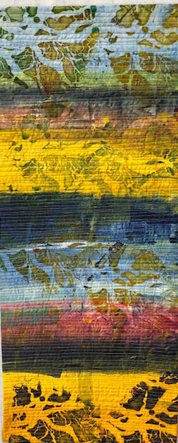
I did make a small art quilt inspired by a hibiscus a few years ago:
Still thinking about how to respond to this sexy banana flower.

This plumbago I planted in honor of my mother, who had a giant one growing in front of her house as long as I can remember:
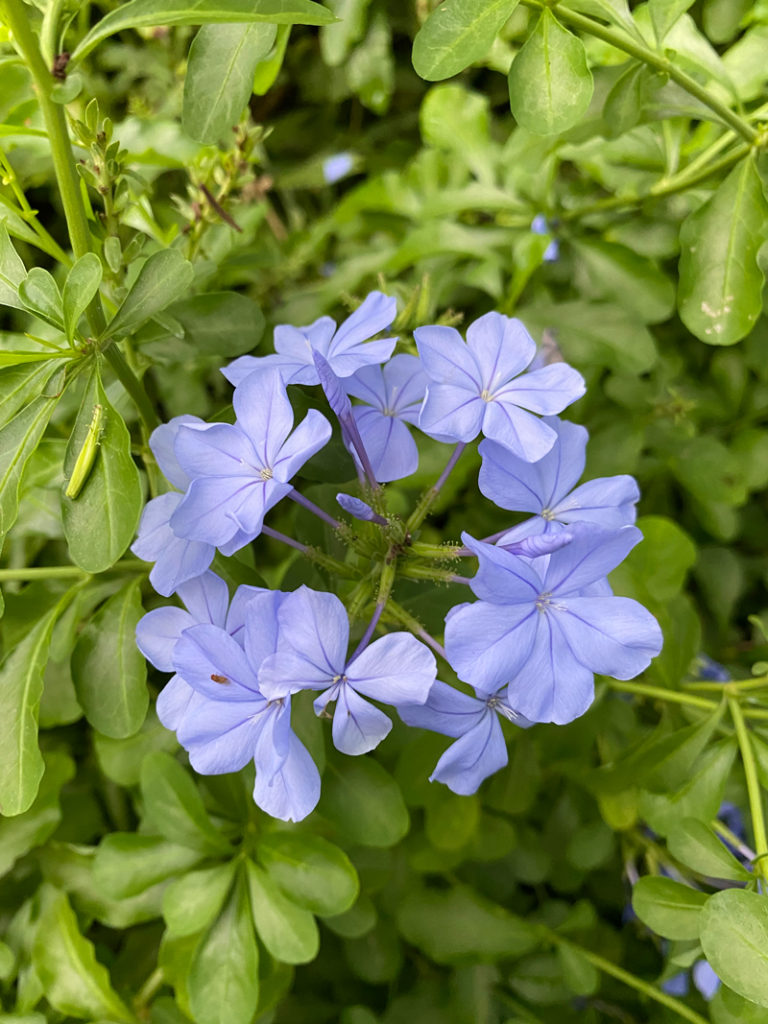
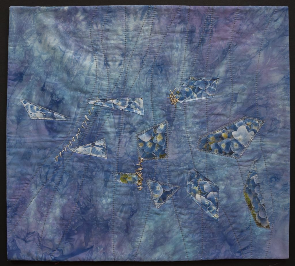
The color is similar to the washed blue/lavender color of the hydrangea she also grew and which I am struggling to grow. She wrote in her journals how she loved Rilke’s poem inspired by the hydrangea.
Blue Hydrangea
Just as the remnant green in tinted pot
So are these leaves, now rough and wrecked
Behind the flower umbels, that reflect
Only a hue of blue, more do they not.
Reflected are they, tear-stained, imperfect,
As if this they were prone to cease,
And as in blue and aged paper leaves
There´s yellow within, grey and violet.
Faded like a washed-out pinafore
No longer worn and of so little use:
How do we our too-short life endure.
But suddenly a blue renewed is seen
Among one of the umbels, and I sense
A blue delighted, smiling at the green.
Rainer Maria Rilke, Tr. Jack Lohrmann
I made a quilt in honor of the hydrangea my mother loved and that I struggled to grow a few years before she died, thinking about how her dementia might have fractured her seeing of it.